Selected system · Case study
FemHealth Research Finder
Free, open-access women's health research aggregator. One query fans out across four default sources in parallel, with thirteen opt-in sources in Advanced Search, returning sex-equity signals next to every result.
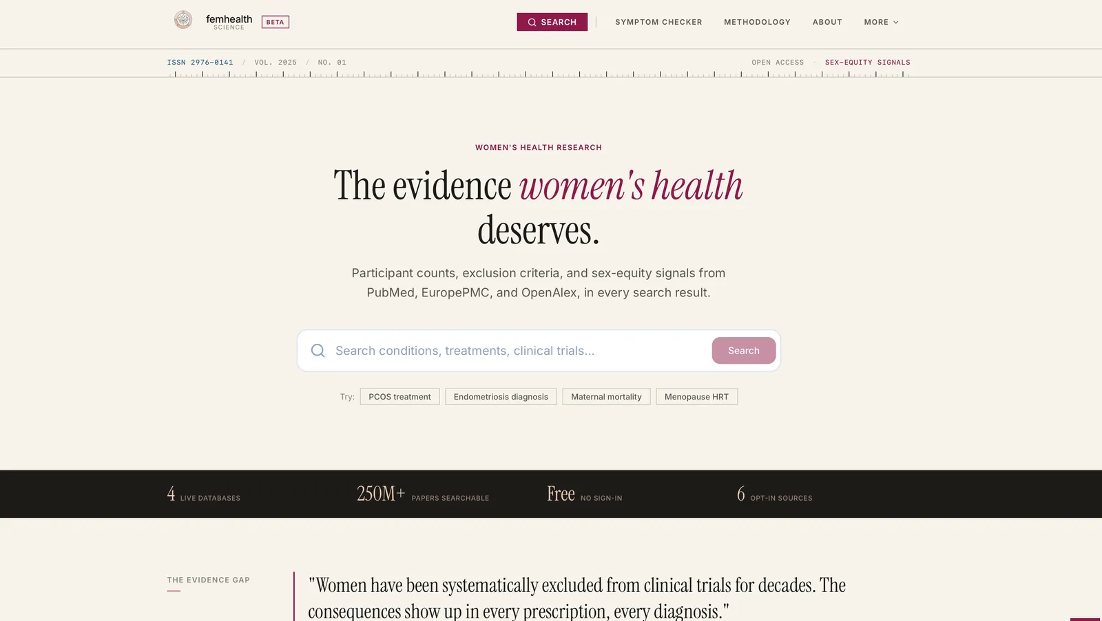
Design Evolution: Before & After
Before: Original Design
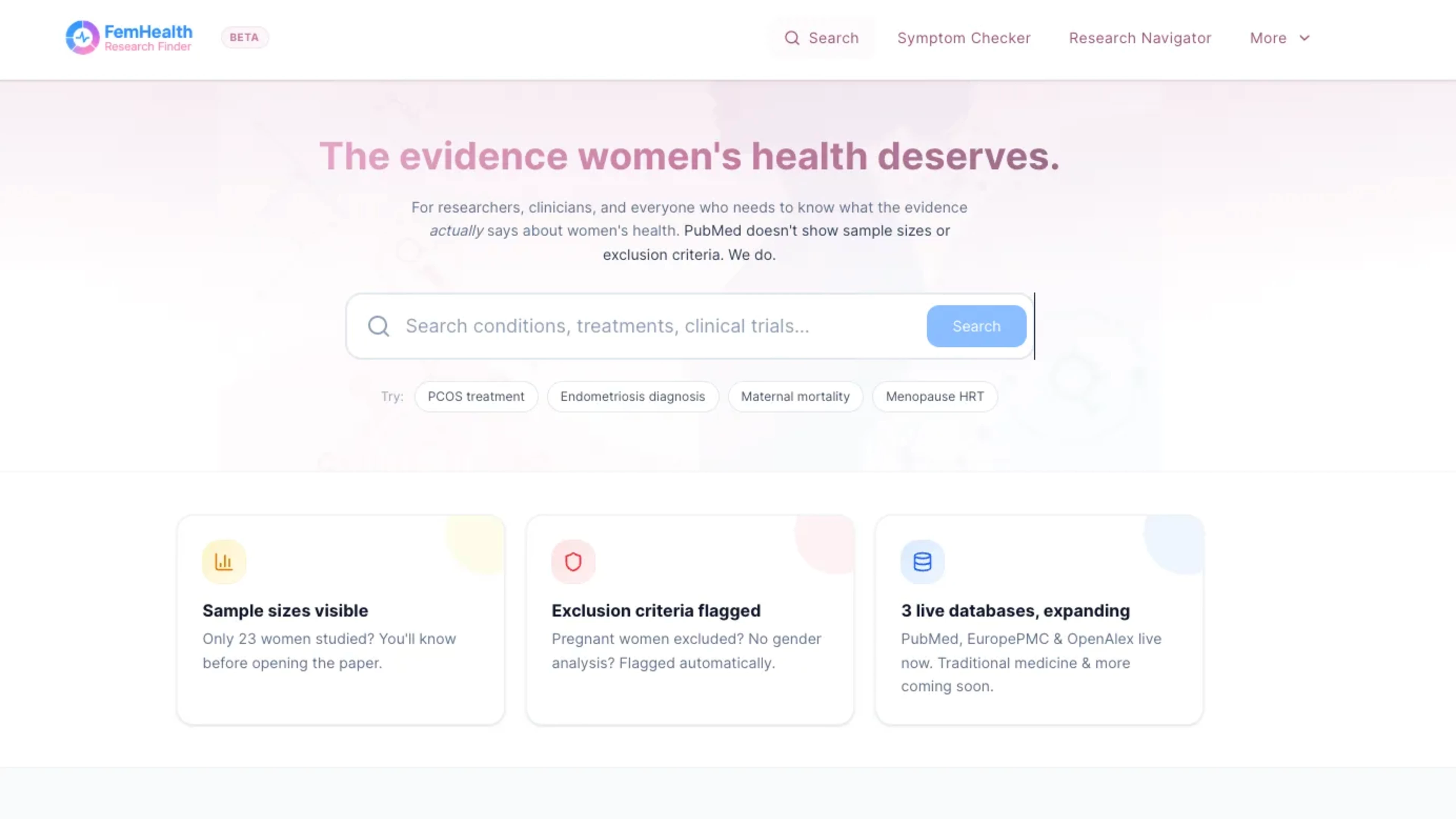
Original blue/pink palette - approachable but perceived as gendered
After: Redesign
Deep burgundy editorial palette, authoritative design with restrained biological-pink accent
Design Decision:
Early user feedback showed the original palette signalled "femtech marketing" rather than clinical trust. I shifted to a more authoritative colour system, a deep burgundy editorial palette, that keeps a biological-pink accent in a disciplined supporting role while aligning with medical credibility.
Duration
Live production platform with a major redesign (2026)
Team
Solo project. Started in Figma and Figma Make to validate the discovery surface fast, then moved into Claude Code once the product needed typed React, accessible primitives, responsive control, and real database and API integration.
My Role
Product Designer, Frontend Developer, Research Strategist, Medical Literature Systems Architect, UX Researcher
The Problem
Women's health evidence exists, but it is structurally hard to reach. High-quality clinical research is fragmented across specialist medical databases, each with its own access logic, terminology, and institutional barriers. These systems were built for academic continuity, not for clinicians under time pressure, advocates building policy arguments, or practitioners working outside universities. The gap was not credibility. It was discoverability. What was missing was a neutral discovery layer that could surface medical evidence across systems while preserving methodological standards and removing unnecessary institutional friction. After launch, feedback revealed a second challenge: the original blue and pink palette, intended to be approachable, read as gendered to some users and risked undermining the platform's authority in medical research.
Process
I built a research discovery interface that fans a single query out across four default sources in parallel, PubMed, EuropePMC, OpenAlex, and ClinicalTrials.gov, with thirteen further opt-in sources available behind advanced controls when a user wants broader coverage: bioRxiv, medRxiv, SciELO, WHO publications, CORE, OpenAIRE, Semantic Scholar, and six traditional medicine corpora. The primary search path routes through a Supabase edge function that owns the rate-limit budget for the whole platform, so user volume does not translate into per-user upstream traffic and the service stays free at any scale. The first product shape came from Figma and Figma Make: fast enough to test structure, language, and the research workflow before over-investing in code. Once the surface needed real interaction quality, database connectivity, and maintainable architecture, I rebuilt it in Claude Code with React, Tailwind v4, and shadcn/ui on top of Radix primitives. Dialogs, dropdowns, tooltips, tabs, and selects are handled by accessible component foundations; styling is driven through a token system rather than one-off visual decisions. I still owned the design work Figma Make does not solve: layout, responsive states, hierarchy, density, and the middle layer between a promising prototype and a product people can actually use. On top of the search layer, a custom extraction pipeline surfaces sex-equity signals from each abstract using pattern matching, not an LLM, and labels every signal with where it came from (structured API field, full text, or abstract). When Semantic Scholar is enabled, an optional one-sentence TLDR sits beside the result so researchers can triage faster without leaving the list. Two search modes are designed in: rapid clinical discovery and deep research exploration, both with advanced filtering by study type, population, and evidence strength. Following that feedback, I ran a major redesign, pivoting from the gendered blue and pink palette to a deep burgundy editorial system, keeping pink only as a restrained accent. The decision came from user feedback that the original colours read as "femtech marketing" rather than clinical trust, and from the strategic need to build credibility while not reinforcing gender bias in healthcare design.
Outcomes
Launched live at femhealth.science. It runs a live federated search across four default sources on every query, with thirteen opt-in sources reachable in Advanced Search, and returns results in seconds. Sex-equity signals and an optional one-sentence TLDR appear next to each result, with a provenance label on every signal, so users can read for methodological gaps without leaving the result list. Using a Supabase edge function as the single rate-limit point keeps the platform free for clinicians, advocates, and practitioners regardless of traffic; high-volume usage never strains the upstream APIs. The production build also moved the interface from prototype fidelity to product fidelity: responsive layouts, accessible interaction patterns, and a reusable design-token foundation.
17
Sources
Live
Platform Status
100M+
Records Reachable
Key Learnings
- A single shared rate-limit point is what lets an open-access service stay free under any volume. Without it, you are one viral moment away from a bill or a ban
- Fanning the default sources out in parallel costs almost nothing in latency when each upstream is hit once per query, not once per user
- Figma to Figma Make to Claude Code is a real product path, not a downgrade. The prototype validates the interface fast; the typed codebase carries it when the surface needs accessible Radix primitives, tokenised styling, responsive behaviour, rate limits, edge functions, and an auditable extraction pipeline
- Medical professionals need different discovery patterns than academic researchers. Speed and clarity matter more than comprehensive search syntax
- Bias detection becomes a powerful advocacy tool when surfaced transparently inside the result row, with its provenance, not buried in a report
- Designing the tool to under-claim rather than over-claim (marking a study "unclear" when the data isn't explicit, instead of guessing) is what earns trust with a research audience
- Colour choices in healthcare design carry unexpected weight and can either reinforce or fight systemic bias